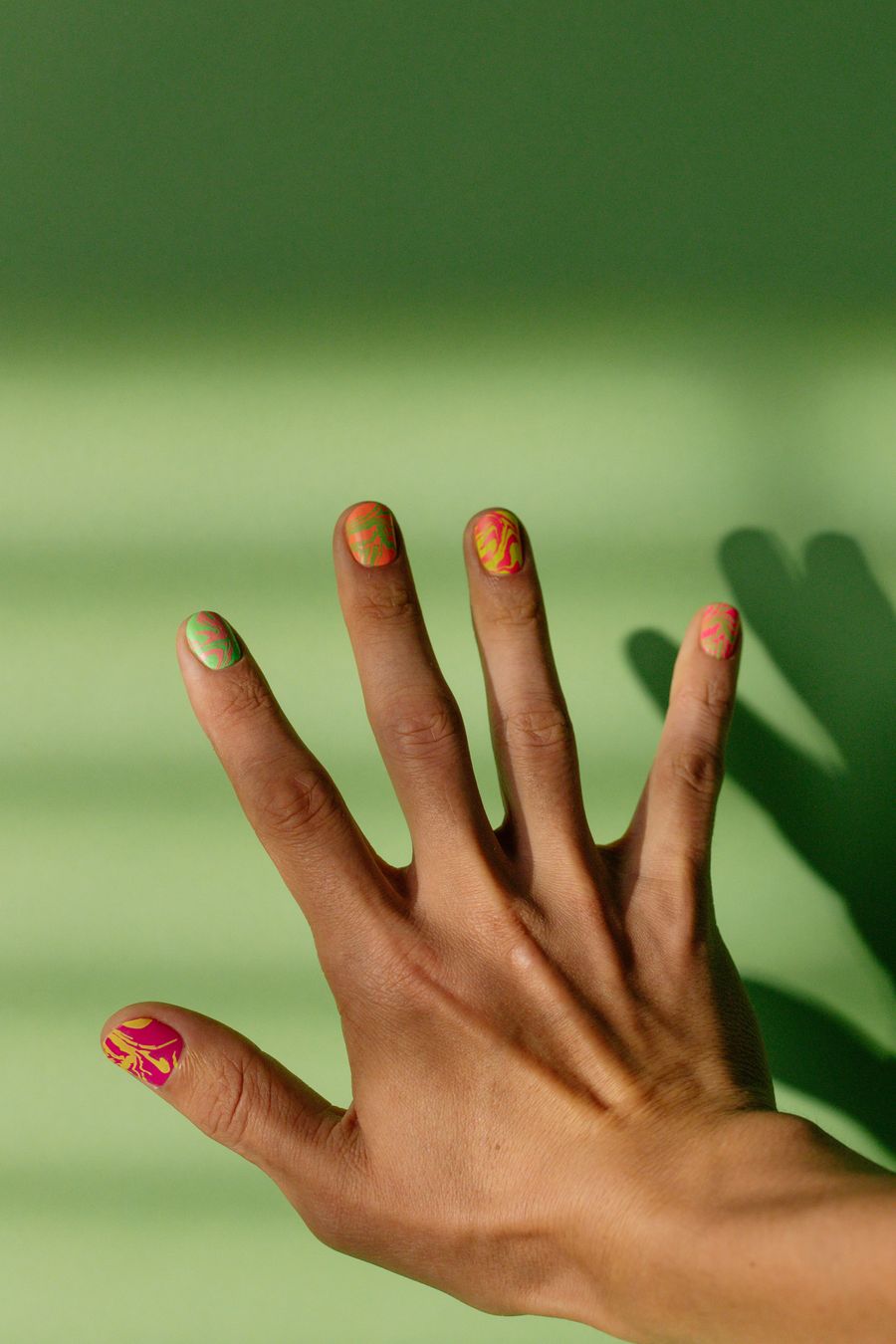
Selecting nail colors for skin tone is often framed as a strict matching exercise, but flattering choices do not rely on rigid rules that forbid specific shades. Any color can work on any complexion; what changes is the visual relationship between undertone harmony, depth, and contrast. Instead of asking whether your skin tone allows emerald green, pastel peach, or cocoa brown, determine what visual effect you want: a seamless, low-contrast neutral that visually elongates your fingers, or a high-contrast statement that highlights your nail shape.
Key Concepts: Undertone, Depth, and Contrast
To understand how nail shades interact with your hands, separate your complexion into three variables:
- Undertone: The subtle temperature beneath your surface skin. As outlined in color guides by Makeup.com, undertones generally lean cool (hints of pink, red, or blue), warm (hints of peach, yellow, or golden olive), or neutral (an even balance of warm and cool tones).
- Depth: The lightness or darkness of your skin tone, ranging from fair and light to medium, tan, and deep.
- Contrast: The visual distance in brightness and saturation between skin and polish. Low-contrast shades blend gently for a subtle look, while high-contrast shades create a sharp boundary that draws focus to the nail silhouette.
Comparing Warmth, Depth, and Contrast in Practice
Rather than treating color families as off-limits, use temperature and contrast to steer the aesthetic:
- Cool Undertones: Shades with blue or violet bases—such as raspberry, icy periwinkle, mauve, and blue-toned red—create effortless tonal harmony. Wearing a warm terracotta or mustard does not clash destructively; instead, it introduces deliberate temperature contrast that makes the shade stand out as an energetic accent.
- Warm Undertones: Warm complexions pair seamlessly with shades infused with gold, peach, and orange undertones, including coral, warm nude, and brick red. Choosing a cool lavender or frosty sky blue provides a crisp, graphic contrast against your skin.
- Neutral and Olive Complexions: As noted in guides by Nail Salon Directories, neutral and olive complexions carry balanced undertones, often with subtle greenish or grayish casts. Earthy neutrals, rich burgundies, muted plums, and burnt sienna provide natural balance without skewing washed out.
- Evaluating Depth: Skin depth determines how dramatic a shade feels. On fair skin, a soft dusty rose acts as a low-contrast neutral, while espresso offers striking contrast. On deep skin tones, that same espresso becomes a chic tonal neutral, while bright cobalt or pastel lemon pops with high-contrast vibrancy.
Why Swatches and Lighting Shift on Your Own Hand
Online polish swatches rarely look identical on your fingers. Swatches are photographed under controlled studio lighting on specialized display tips or hands with different underlying pigments.
Lighting, screen settings, and the sheerness of a polish can change how a shade appears. Hold a physical swatch against your hand if the salon has one, and check it in another light when possible. This is more useful than relying on a product photo alone.
Exploring Digital Concepts Responsibly
Digital tools help visualize directions before your appointment. You can brainstorm color concepts on NailMoodLab and test candidate shades against your hands using virtual try-on. You can also evaluate how specific colors pair with your finger proportions using hand-shape analysis.
Keep in mind that digital previews are concept renders designed to explore ideas, not guaranteed physical salon outcomes. A screen image cannot simulate the exact transparency of a formula, the gloss of a professional topcoat, or shifting ambient sunlight.
Trade-offs and Common Mistakes
- Treating Undertone Rules as Bans: Assuming certain colors are forbidden limits your options. Undertone guidelines explain harmony, but contrast is an equally valid design choice.
- Ignoring Formula Opacity: A sheer jelly polish allows natural nail beds to show through, altering perceived undertones. An opaque creme formula delivers consistent pigment regardless of underlying nail beds.
- Judging Color in the Bottle: Lacquer looks denser and darker pooled in a glass bottle than it does applied in thin coats on the nail plate.
Concise Decision Checklist
- Define Your Goal: Decide between a low-contrast elongating neutral or a bold, high-contrast statement.
- Observe Your Undertone: Note whether warm gold or cool silver tones feel more naturally harmonious against your skin.
- Check the Formula Finish: Choose between sheer jelly, luminous shimmer, or full-coverage creme.
- Inspect in Natural Light: Hold swatch sticks directly over your cuticle near a window before polishing.
What to Bring and Ask at the Salon
When visiting a nail technician, clear communication helps translate your color vision:
- Bring a Visual Concept: Show a photo or concept render, but clarify whether you want the exact hue or simply the overall mood.
- Request a Cuticle Swatch: Ask: "Can we hold these two swatch sticks directly against my cuticle in natural light before we start?"
- Clarify Sheerness and Coats: Ask: "Is this polish sheer or full-coverage, and will two coats provide the depth of color I want?"