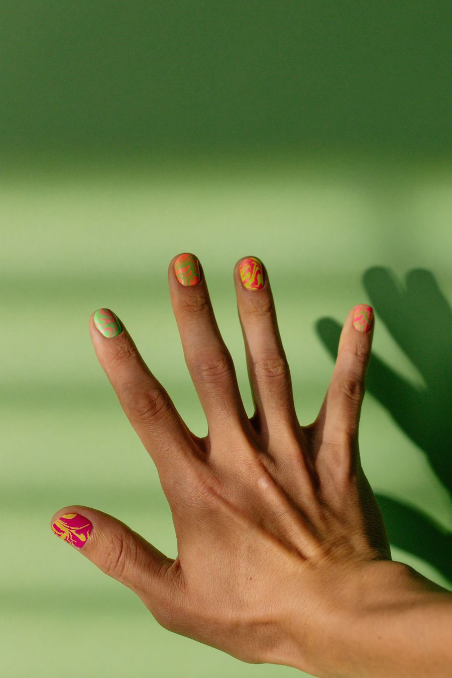
Choose color block nails by deciding how much space each color should occupy, then choose the shape that divides those areas. A balanced split, a small corner wedge, and a contrasting tip block can use the same palette while producing very different compositions.
If a reference feels too bold, the answer is not necessarily more shapes or softer colors. You might simply want less of the accent shade. Separate those decisions so you can keep the color you like without also keeping a layout you do not.
Think in areas, not intricate motifs
For this kind of design, the filled regions are the main subject. You are not asking a tiny symbol to remain recognizable or a line pattern to repeat. The shape of each area, its relative size, and its boundary with the next color do the work.
Start with two colors and describe which should dominate. “Mostly cream with a cobalt corner” is more useful than “cream and cobalt geometric nails.” The second request leaves the quantity and placement of each shade undecided.
Also distinguish blocking within a nail from assigning a different solid shade to each nail. A set of plain multicolored nails might use your chosen palette without containing any divided color areas. If you want both, state which nails should carry blocks and which should remain solid when discussing the final plan with your artist.
Compare three shapes with the same palette
Keep the colors fixed while comparing these layouts. That makes it easier to identify whether you prefer the division itself rather than simply the shades in a particular photograph.
| Shape plan | What it emphasizes | What to specify |
|---|---|---|
| Split | Two substantial regions sharing the nail | Equal-looking areas or a deliberately larger side; straight or curved division |
| Corner wedge | A smaller accent meeting the nail's edge | Which corner, how far it reaches, and whether the point stays sharp-looking |
| Tip block | A contrasting area concentrated at the end | Depth of the block and the shape of its lower boundary |
A split gives both colors a major role. If that feels like too much of your brighter shade, compare an unequal division before replacing the palette. A split also need not run through the exact center; its position is part of the composition.
A corner wedge is useful when you want the base to remain the largest area. Decide whether the wedge is a small interruption or a substantial section. Calling it a “tiny triangle” while showing a reference that covers much of the nail creates unnecessary ambiguity.
A tip block makes the end section the accent. Decide whether you want a straight division, a slanted edge, or a curved boundary. This guide concerns the color area, not a particular French-tip technique. Confirm the actual interpretation with the artist.
Balance color quantities across the set
Review the whole hand, not just the most interesting nail. An accent color used in a small corner on several nails can play a different role from the same color filling a whole companion nail. Decide whether you want the set to preserve a consistent dominant shade or alternate which color leads.
For example, cream with small cobalt blocks keeps cream as the main field. Reversing some nails to cobalt with cream corners adds larger blue areas even though the palette stays unchanged. Neither is wrong; they are different balances.
In a public discussion, someone who felt their blocks looked too large received suggestions to change the color order, vary block sizes, or limit blocking to an accent. Those were individual preferences rather than rules, but they show why “too much” needs a more specific diagnosis. Read the discussion.
Ask yourself which part feels excessive: the amount of a color, the contrast between shades, the number of boundaries, or the number of patterned nails. Change that variable first. Turning every large block into several small ones could add precisely the busyness you wanted to remove.
Decide whether colors touch or stay apart
A direct boundary lets two color areas meet. An outline adds a third visual element. A visible channel between blocks creates another kind of division, which might look like the base color or a sheer-looking space.
Specify the intended appearance instead of assuming “negative space” settles it. “Cream visible between the blue and brown areas” is different from asking for an open-looking channel with no opaque color. Your artist can then discuss how the desired result would be interpreted.
Outlines are optional. A dark divider may be the feature you like, but it also changes a simple two-color plan into one with a separate border color. If you do not want that effect, include “no outlined borders” in your reference notes.
Inspect corners and meeting points too. Does a narrow leftover sliver belong in the design? Should adjacent blocks meet cleanly, or is a gap intentional? Resolve those questions before treating a generated arrangement as your final choice.
Keep solid fills separate from patterned fills
Color blocking does not require every region to contain additional detail. If you like a plain geometric arrangement, ask for solid-looking color areas rather than marble veins, tortoiseshell patches, shimmer, or gradients within each block.
If a patterned section is the feature you want, identify it as an additional choice. The guides to tortoiseshell placement and marble vein scale address those separate design questions. Settle the boundary of that section before deciding how detailed its interior should be.
For short nails, a small number of clearly defined areas can be a useful comparison against a many-part reference. You do not need to copy every division from a longer nail. Keep the color relationship or the dominant shape that attracted you, then ask what translates to the planned length.
Example: keeping cobalt while reducing its area
Imagine a client planning short rounded nails who likes cream and cobalt but finds an evenly split reference more blue than they want. This is a hypothetical example.
They could keep both shades and replace the split with cobalt corner wedges on a cream field. This changes color quantity without changing the palette. If they also add a solid cobalt accent at the same time, however, they should review the whole set again because that restores a larger blue area.
The initial brief might therefore say: “Short rounded nails, mostly cream with small cobalt corner blocks, clear boundaries, no outlines or extra shapes. Keep cream dominant across the set.” Final wedge placement remains a conversation with the nail artist.
Turn the area plan into a preview
In NailMoodLab, combine the example's palette and shape plan with your preferred finish. Use the optional Things to avoid field for “equal halves, solid cobalt nails, black outlines, gradients, extra colors” if those would contradict your goal.
Review whether the generated concept preserves the dominant cream area. Watch for wedges becoming broad panels or extra colors appearing at intersections. Prompt requests guide a creative preview; they do not guarantee precise proportions, boundaries, or per-finger placement.
Generation requires sign-in and available AI allowance. Check current allowance, plans, and billing options before planning repeated use or paid access. Download a useful design image and retain the written area priorities alongside it.
For hand try-on, provide both a clear hand photo and a design image. The result may alter details and cannot establish exact fit or salon feasibility. Confirm the palette, dominant area, boundary shape, and final technique with your nail artist before considering the design settled.