Tortoiseshell nails combine a warm amber or caramel background with irregular darker patches and a layered, translucent-looking depth. To choose your version, decide how light or dark you want the palette, how large the patches should appear, and whether the pattern covers every nail, selected accents, or just the tips.
The defining feature is uneven, organic color variation rather than a uniform row of spots. A clear reference helps your nail professional understand the effect you want while leaving room to adapt it to your chosen length, products, and appointment.
Understand the visual layers
Think of the look as three visual roles: a lighter warm base, midtone brown areas, and a smaller amount of darker contrast. The colors appear to overlap rather than sit as identical flat dots.
This describes the appearance, not a mandatory application recipe. Different products and techniques can create different interpretations. Ask the professional how they would achieve the desired effect with the service you are booking.
When comparing references, look for areas where the lighter base remains visible. If dark patches cover nearly everything, the result may read as mostly brown or black at ordinary viewing size.
Also inspect the patch edges. Soft, irregular boundaries create a different impression from sharply outlined spots. Decide which quality attracts you before choosing a full design.
Choose the palette before the placement
Light amber and caramel
A lighter base makes the pattern feel more open and allows the contrast between translucent-looking areas and dark patches to stand out. This can be a useful direction if you want the tortoiseshell effect to remain visible without making the whole set very dark.
Keep some deeper accents so the design does not become an undifferentiated warm wash. The balance matters more than the exact shade name in a photograph.
Medium brown with darker accents
A medium palette can create a more concentrated pattern while still showing the base. Compare references at whole-hand size to see whether the patches remain distinct.
If you pair patterned nails with solid ones, choose a supporting brown that relates to the pattern. It need not match every patch exactly, but it should feel like part of the same palette.
Deep brown and near-black
A darker version can be visually strong, especially when the lighter amber appears in limited openings. The trade-off is that fine variation may disappear in dim viewing conditions or small photos.
Ask for the amount of visible light area you want. “Dark overall, but with clear amber windows” communicates more than asking for “dark tortoiseshell” without a reference.
Select a placement that fits your preference
| Placement | Visual effect | Main planning question |
|---|---|---|
| Full patterned set | The texture becomes the main identity of the manicure | How much contrast and variation should repeat across every nail? |
| One or two accents per hand | Pattern stands out against quieter nails | Which solid color best supports the pattern? |
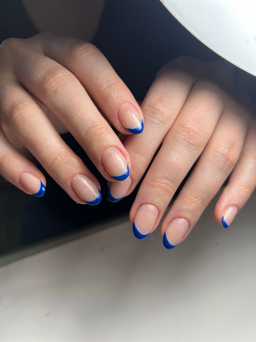
| French-inspired tips | Pattern becomes an edge detail | Is there enough tip area for the patches to remain readable? |
| Partial side or curved panel | Combines the texture with open space | Where should the pattern begin and end? |
Choose the role before adding other motifs. Tortoiseshell already contains visual variation; combining it with several unrelated patterns can make the set difficult to read.
A limited accent arrangement is a useful comparison if you like the texture but are unsure about wearing it across every nail. You can preserve the same palette and change only the amount of pattern.
Scale the patches to the nail canvas
For a shorter nail, use a few clear irregular areas rather than shrinking a dense long-nail reference unchanged. The pattern should remain recognizable when you look at the whole hand.
For a longer nail, larger patches or more spacing can preserve the same character. More length does not require a higher density of tiny marks.
French-inspired tips create a special challenge because the patterned area is narrow. A reference that looks rich on a full nail may become a busy dark band at the tip. Ask the professional how to simplify the pattern while keeping its amber-and-brown character.
If you want open space, identify whether that area should have a sheer base, an opaque neutral, or another finish. “Negative space” can be interpreted differently, so a clear image and description help.
Keep the set cohesive without making every patch identical
The individual patches do not need to repeat exactly. Consistency can come from the same palette, similar contrast, and a related scale across the nails.
Decide whether both hands should have the same accent placement or a more varied arrangement. Include the thumbs in the plan, especially if the reference does not show them.
If the set includes solid-color nails, choose their role deliberately. A lighter neutral creates a quieter contrast; a deep brown makes the overall set darker. Compare those options while keeping the patterned reference the same.
Avoid adding metallic lines or gems only because they appear in one inspiration image. Decide whether they are essential to your preference. A simpler version may explain the tortoiseshell effect more clearly.
Recognize references that may be misleading
Strong reflections can make the base look lighter or more translucent than it would under ordinary light. An edited image may also exaggerate amber tones or deepen the dark patches.
AI images can add another layer of uncertainty. Inspect whether patches remain inside the nail boundaries and whether the apparent layering is coherent. Some images suggest depth through impossible highlights or change the nail's shape to accommodate the pattern.
A flat spot pattern is not necessarily unusable, but it may not be the effect you mean by tortoiseshell. Identify the difference rather than relying on the label.
Use a reference to communicate color relationships and pattern character, then compare actual salon options for the final finish. A screen cannot guarantee an exact material appearance.
Generate a focused concept for comparison
NailMoodLab supports prompt-based design generation, hand-photo nail-shape suggestions, and two-image virtual try-on. Generated designs can be regenerated, downloaded, shared, or copied by URL.
Try this starting direction:
Short oval nail concept with warm amber and caramel tortoiseshell-inspired accents on the ring fingers. Use irregular soft-edged dark-brown patches with lighter areas showing between them. Keep the other nails solid warm brown. Glossy finish, flat design, no metallic lines or raised pieces.
Inspect the result for patch scale, contrast, and boundaries. If it is too dark, ask for more visible amber areas while retaining the same placement. If it is too busy, reduce the number of patches rather than changing the whole design.
Use virtual try-on to compare full-pattern and accent versions on the same hand photo. Check the original and preview for altered hand proportions. The result is a visual aid, not a measurement or fit assessment.
Bring a clear brief to the salon
Describe your priorities in order. For example: “I want a warm amber base, soft irregular brown patches, and only two accent nails. The exact patch shapes can vary.”
Ask how the pattern will be adapted to your chosen length and service. Confirm the available finish, appointment time, and price directly with the salon.
The salon reference-photo guide can help you distinguish essential features from flexible ones. If you want a quieter fallback, the minimalist nail-art guide offers ways to keep the pattern as a limited accent.
Before choosing, check:
- The light, medium, and dark color roles are clear.
- Patch edges and scale match the effect you want.
- Placement is defined across both hands.
- The pattern remains readable at normal size.
- Lighting or AI artifacts are not mistaken for real material behavior.
- The professional has assessed the practical interpretation.
Explore one palette and placement in NailMoodLab, then take the clearest reference to your nail professional. For recurring planning, review your current account allowance and available plan details. Consider a future purchase only when checkout is available and the offer fits your actual use.