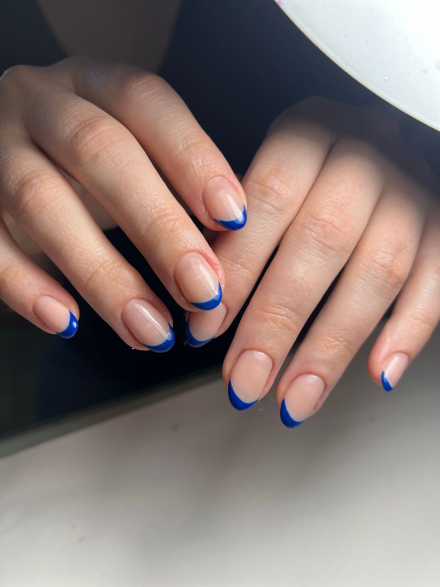
The most common AI nail preview mistakes happen when unclear inputs or distorted outputs are treated as reliable design advice. Use a sharp, evenly lit hand photo, keep nail edges visible, compare one change at a time, and inspect the result against the original. A convincing image is still a visual proposal, not a measurement, fit guarantee, or promise of salon reproduction.
When a preview looks wrong, identify the problem before generating again. A new hand photo may help more than a new prompt, while an attractive but impossible detail may need a simpler reference rather than more attempts at the same image.
1. Starting with a blurry hand photo
Blur makes the nail outline, fingertip, and existing surface difficult to distinguish. If you cannot see those details clearly, it becomes harder to judge whether the generated design respects them.
What to look for: soft nail edges, motion streaks, or one finger in focus while the others are unclear. A small phone preview may hide the issue, so inspect the source more closely before uploading.
What to change: clean the lens, steady the camera, and retake the photo with enough light. Use a straightforward camera mode if portrait effects blur parts of the hand.
Do not keep regenerating from an obviously unclear source and assume the best-looking result must be accurate. A sharper input gives you a better baseline for review, even though it cannot guarantee perfect output.
2. Hiding nails behind fingers, objects, or the crop
Overlapping fingers, a thumb turned away from the camera, or a cropped fingertip removes information from the image. A decorative pose holding a bottle may be attractive but unsuitable for evaluating every nail.
What to look for: nail surfaces partly covered, edges missing, or fingers touching so closely that their boundaries are ambiguous.
What to change: rest the hand in a relaxed palm-down pose, separate fingers slightly, and leave space around the fingertips. Keep the camera angle direct enough to show the nail surfaces without forcing an uncomfortable pose.
If a nail remains hidden, do not assume the preview has reconstructed it faithfully. Treat that part as uncertain and use a clearer source when it matters to the design decision.
3. Letting glare and mixed lighting change the comparison
Strong reflections can hide nail detail, while colored indoor lighting can shift the appearance of both the hand and the reference. A bright glossy design may look lighter simply because of its highlights.
What to look for: featureless bright patches, deep shadows across some nails, or noticeably different color casts in different parts of the hand.
What to change: use soft, even light and a simple background. Move the hand or camera slightly to reduce glare rather than applying heavy color edits to the source.
For comparisons, use the same hand photo. Do not choose a palette based on one preview captured in warm light and another in cool light. Even with consistent input, use salon samples when an exact real-world color or finish matters.
4. Using an ambiguous design reference
A collage with several sets, heavy decoration, and different lengths can leave your intended design unclear. The result may combine details you never meant to combine.
What to look for: the output borrows a color from one image, a shape from another, or a pattern you did not consider central.
What to change: choose one clear reference and identify the features you want: palette, finish, motif, and placement. If generating a concept, use a concise prompt that describes those visible choices.
For example, “short oval, sheer warm pink, glossy finish, one small white flower on each ring finger” is more specific than “elegant floral nails.” Keep exclusions brief, such as no raised pieces or no glitter.
Inspect the generated reference before using it for try-on. A confusing design image does not become a precise brief simply because it is placed on your own hand.
5. Treating changed anatomy or unrealistic length as a better fit
An image may look flattering because it narrows fingers, changes nail-bed proportions, or adds length in a way that no longer matches the source. That is not evidence that the manicure suits your actual hand.
What to look for: extra or merged fingers, shifted nail boundaries, inconsistent tip directions, or a noticeably different hand silhouette.
What to change: compare the original and preview directly. Reject or regenerate results where the distortion prevents a useful visual comparison. Keep your written preference for the design separate from the inaccurate rendering.
A virtual image cannot determine which shape is physically feasible or whether extensions are needed. Ask a nail professional to assess your current nails and the service you are considering rather than using the preview as a measurement.
6. Changing too many variables between options
If one preview is short, pale, and plain while another is long, dark, and heavily decorated, you may know which image you like without learning which feature drives the preference.
What to look for: uncertainty about whether you prefer the shape, color, finish, or art—and repeated changes that never narrow the decision.
What to change: choose one question. Compare two colors on the same shape and length, or compare two outlines with the same simple finish. Keep the hand photo and viewing scale consistent.
After choosing that feature, hold it steady and test the next one. Save the useful versions with clear labels so you can explain the final combination.
Do not compare a distorted rendering with a clean one and call the cleaner output the winning design. Resolve image quality first so the comparison is about the manicure.
7. Treating the preview as an exact salon instruction
AI can produce intricate-looking patterns that are unclear when inspected closely, effects without an obvious real material, or details too dense for the length you want.
What to look for: tiny inconsistent lettering, motifs that change shape across nails, floating embellishments, or reflections that suggest impossible construction.
What to change: describe the visual priorities and ask the professional how to interpret them. Keep a simpler fallback that preserves the palette or main motif if the exact detail is not practical.
The salon reference-photo guide can help you explain what matters most. Confirm feasibility, appointment time, and price directly with the salon. The preview does not establish those details or diagnose nail condition.
Use a fix-first review before regenerating
| Main problem | First action |
|---|---|
| Source is blurry, cropped, or obstructed | Retake the hand photo |
| Glare or color cast hides detail | Improve the capture lighting |
| Reference contains competing designs | Select one clearer direction |
| Preview changes the hand or nail boundaries | Reject the distorted result and reassess inputs |
| Options differ in several ways | Restart a single-variable comparison |
| Art is visually incoherent or too dense | Simplify the reference or prompt |
| Feasibility or price is uncertain | Ask the nail professional |
This sequence helps you avoid repeated attempts without a reason for the next one. Keep the original photo and a short note about what you changed so you can tell whether the adjustment helped.
Use NailMoodLab as a planning tool
NailMoodLab offers two-image virtual try-on, alongside prompt-based generation and hand-photo shape suggestions. Generated designs can be regenerated, downloaded, shared, or copied by URL.
Start with a clear hand photo and one reference, review the output, and change only the input related to the problem you found. Do not assume the tool automatically validates anatomy, physical fit, or salon feasibility.
When the image is good enough to explain your preference, save it and write down the essential details. A clear reference plus a short note is more useful than a large collection of unreviewed outputs.
Before using a preview, confirm:
- The source is clear, evenly lit, and complete.
- Nail edges and finger boundaries remain coherent.
- The intended design is unambiguous.
- Comparisons use consistent inputs and scale.
- Unrealistic details are identified or simplified.
- The result is labeled as a concept for discussion.
Try a controlled comparison with NailMoodLab virtual try-on, then take the preferred direction to your professional. For regular planning, review your current account allowance and available plan details. Consider a future purchase only when checkout is available and the offer fits your actual use.