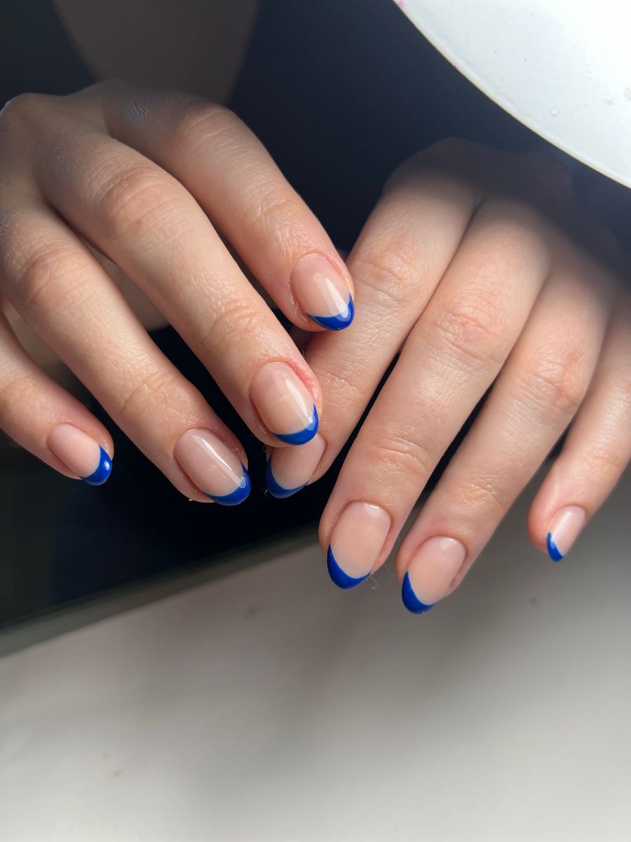
To compare nail designs on your hand fairly, use the same clear hand photo for both options and change one main variable at a time. Compare color with the same shape and length, or compare shapes with the same simple color. Review both previews at a normal viewing size, then inspect detail for distortions before choosing a reference to discuss with your nail professional.
The purpose is to make your preference clearer. A virtual preview can help you visualize a direction, but it does not measure your nails, guarantee fit, or establish that every generated detail can be reproduced in a salon.
Decide which question you are trying to answer
Two attractive references can differ in several ways at once: length, shape, base color, finish, pattern, and accent placement. If you compare all of those together, you may know which picture you prefer without understanding why.
Choose one decision for the first comparison. Examples include warm pink versus cooler pink, almond versus a straighter outline, or one accent nail versus several. Keep the remaining details as similar as practical.
Write a short sentence such as, “I am choosing the base color for a short, glossy manicure.” This gives you a clear way to reject distractions when an image has appealing jewelry, lighting, or styling unrelated to the nail decision.
You can compare complete looks later. First isolate the feature that is making you uncertain.
Prepare one reliable hand photo
Use an evenly lit photograph that clearly shows the nails you want to preview. Keep your hand relaxed, fingers separated enough to distinguish nail boundaries, and the camera angle straightforward.
Avoid strong glare, deep shadows, motion blur, and objects covering the nails. A patterned background or prominent jewelry can also distract you from the comparison, so keep the scene simple.
Use the same source image for both options. Changing the hand position, light, or camera distance can make one design look more flattering for reasons unrelated to the manicure.
Do not retouch the hand differently between versions. If one preview appears to lengthen fingers, narrow nail beds, or change skin appearance, treat that as a comparison problem rather than a benefit of the design.
Keep the original photo available so you can check whether the preview preserved the hand and nail boundaries reasonably.
Choose references that support the comparison
A clear nail reference is easier to interpret than a collage containing many hands and styles. Identify which features you intend to transfer: color, motif, finish, shape, or a combination.
If the reference uses a much longer nail than you want, note that difference before generating a preview. A detailed pattern may need to be simplified for your planned length. Do not assume the same composition will fit unchanged.
For a color comparison, use simple references with similar finish and lighting where possible. A glossy photograph with bright reflections can appear lighter than a matte reference even if their intended base colors are close.
For a pattern comparison, keep the palette stable. This makes it easier to tell whether you prefer the arrangement itself or simply one set of colors.
Make the two previews in a controlled way
NailMoodLab offers prompt-based nail design generation, hand-photo nail-shape suggestions, and two-image virtual try-on. For try-on, use your hand image with the selected design reference, then repeat with the second reference while keeping the hand photo the same.
Treat each result as a visual proposal. The tool may not preserve every detail or follow every instruction exactly. Inspect the result before using it to judge a color or shape.
If you generate references from prompts, keep the prompts parallel. For example:
Short rounded nails, glossy muted rose base, no embellishments, consistent color across the set.
For the second option, change only “muted rose” to “soft peach.” Do not simultaneously add chrome, increase length, and introduce accent art unless you intentionally want to compare two complete concepts.
Save or download the versions you want to compare and label them by the decision, such as “rose” and “peach.” Do not rely on remembering which regenerated image came first.
Review at two viewing sizes
Start with the whole hand
Look at both previews at a similar, ordinary display size. Ask which design you would prefer to see during daily activities, not just which makes the most dramatic close-up.
Notice overall balance: how much visual attention the manicure draws, whether the color feels comfortable to you, and whether accent placement makes the set feel intentional.
Keep the images at the same scale. A larger preview can make detail look more impressive and exaggerate the apparent length. If you place them side by side in a separate viewer, align the hands as closely as practical without stretching either image.
Then inspect the details
Zoom in to check nail edges, shape consistency, and the boundary between the design and skin. Look for stray color, duplicated details, distorted fingers, or patterns that spill outside a nail.
Do not choose an option because it contains a visually appealing error. A design that seems to create a narrower nail bed or a more symmetrical hand may be changing the anatomy rather than answering your manicure question.
If one preview is clearly less faithful, regenerate or choose a clearer reference before comparing. Otherwise, you are judging output quality rather than the two designs.
Use a comparison sheet that reflects your priorities
| Question | What to look for |
|---|---|
| Color preference | Which palette do you prefer under the same viewing conditions? |
| Shape preference | Which outline appeals to you without relying on changed hand proportions? |
| Length preference | Which visual length fits the routine you intend to discuss with the salon? |
| Accent balance | Does one focal nail feel sufficient, or do you prefer a more distributed pattern? |
| Everyday appeal | Would you still enjoy the design outside a close-up photo? |
| Reference quality | Are the details clear enough to explain to a nail professional? |
Do not turn the table into an artificial precision score. A simple note explaining why you prefer one option is often more useful than assigning numbers to every feature.
For example, “I prefer the darker base, but only one accent nail” can become a clear final direction even when neither original reference is the complete answer.
Make a combined choice without losing control
Once you have selected a preferred color or shape, keep it fixed for the next comparison. Then test the next uncertain variable, such as accent placement or finish.
If you like the palette from one design and the pattern from another, write the combination explicitly. Avoid asking the salon to infer your intention from two images with conflicting details.
Keep a preferred reference and a simpler fallback. A detailed AI motif may require adjustment because of your chosen length, available materials, appointment time, or the professional's technique.
Do not keep regenerating solely in search of a flawless fantasy image. Stop when you can explain the important choices and the preview is clear enough to support a useful consultation.
Bring the result into a real appointment conversation
Show the selected image and explain which features matter most. Identify the intended shape, approximate length preference, palette, finish, and accent placement in words. The salon reference-photo guide can help you turn those choices into a clear conversation.
Ask the nail professional what is practical for your current nails and the service you are booking. Let them assess feasibility rather than treating the preview as a measurement or a guaranteed result.
Discuss how a complex detail could be simplified while preserving the overall idea. A fine repeated pattern might become a single accent, or a dramatic finish might need a different product choice.
Also confirm the expected time, price, and any additional work directly with the salon. The preview itself does not establish those details.
Final two-design comparison checklist
- Both options use the same clear hand photo.
- One main variable is being compared at a time.
- Lighting and reference differences are considered.
- Whole-hand views are compared at similar sizes.
- Nail boundaries and hand proportions are checked for distortion.
- The preferred features are written in plain language.
- A simpler fallback is available if needed.
- The final image is treated as a consultation aid.
Try one controlled comparison with NailMoodLab virtual try-on, then take the preferred direction to your nail professional. If you plan to compare looks regularly, review your current account allowance and available plan information. Base any future plan decision on actual use and purchase only if checkout becomes available and the offer fits your needs.