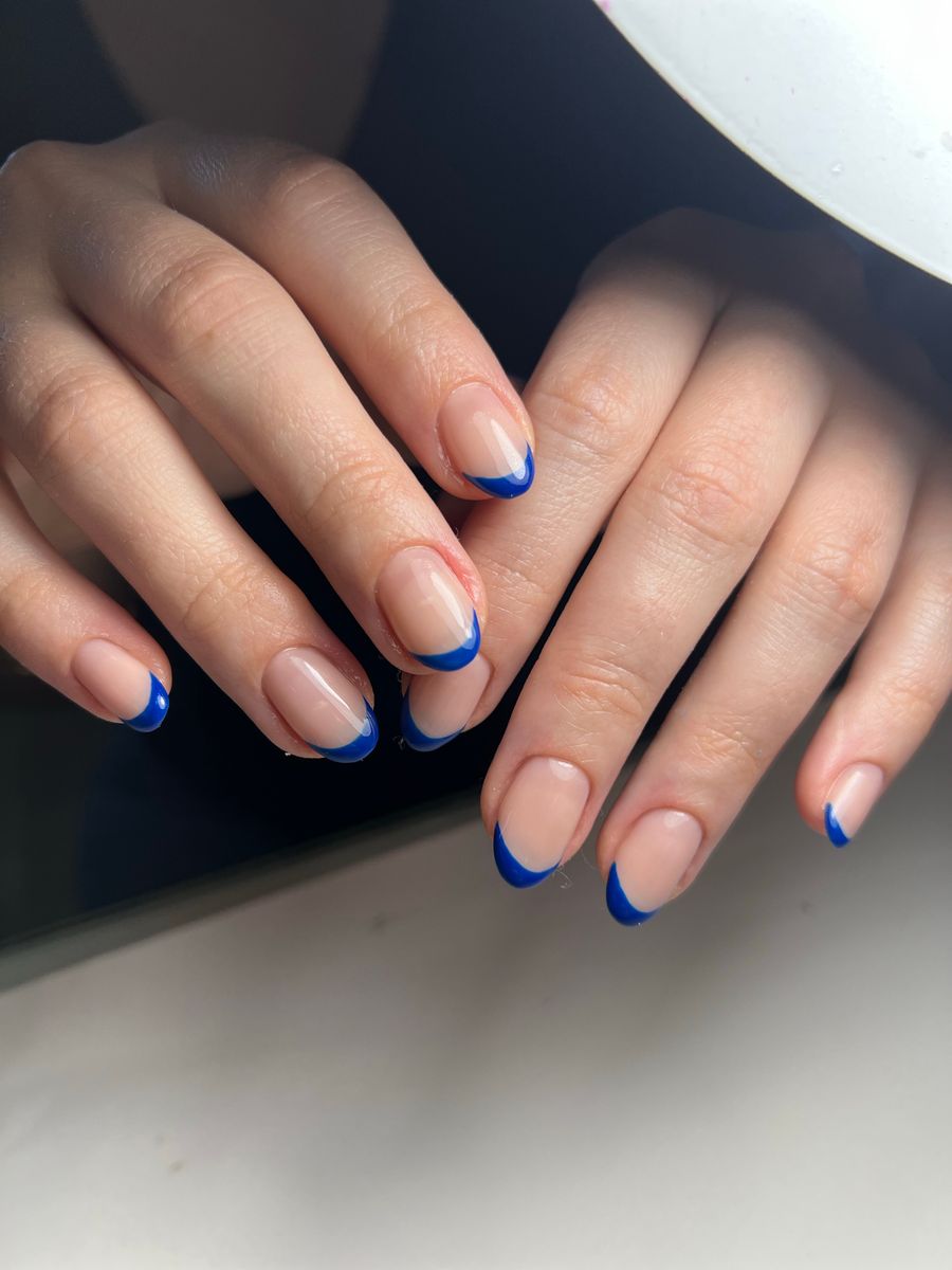
Choose striped nail designs in three passes: direction first, the relationship between stripe widths second, and the gaps between them third. A single vertical border, a broad diagonal band, and a horizontal repeat are different compositions even when they use the same colors.
Decide which arrangement you enjoy rather than expecting a direction to lengthen or slim your fingers. The useful outcome is a reference that explains where the lines go and how they repeat—not a promise about changing your proportions.
Pick a route across the nail
Describe direction relative to the nail, not the way a hand happens to be posed in a photograph. Vertical means running mainly between the cuticle and fingertip. Horizontal means crossing from side to side. Diagonal means crossing on a slant between those directions.
A vertical border leaves the center available
A line near one side can act as a border rather than dividing the entire nail into repeated stripes. Specify whether it follows the side's curve or should appear straight within the design. Those are different requests, particularly when the reference and your intended nail shape differ.
You might choose a single border for a mostly plain manicure, or pair a broader stripe with a finer neighboring line. Clarify whether both sides should be bordered; “vertical stripes” alone could produce a much fuller pattern than you meant.
A diagonal band creates a defined crossing
A broad diagonal band can stand alone, with plain base on either side. Alternatively, parallel diagonal lines can repeat across the nail. Decide whether the band should keep a consistent width or intentionally change width.
For a coordinated set, tell the artist whether you want the slant to follow the same direction or alternate. A reference containing both may be intentional, but it should not leave this choice to guesswork.
Horizontal stripes emphasize the sequence
For side-to-side stripes, the order from cuticle to tip becomes part of the design. You can ask for equal bands, a broad-and-fine repeat, or a small group of stripes in one area.
If the pattern is concentrated at the tip, clarify whether it should follow a curved tip boundary or remain a straighter banded arrangement. For the underlying tip shape, see French Tips for Short Nails. The stripe decision is about the sequence inside that area.
Describe the rhythm without measuring every line
Rhythm is the repeating relationship between colored stripes and the spaces around them. It can be regular or deliberately varied. A broad stripe followed by a narrow one creates a different pattern from identical thin lines, even if both use a single color.
You do not need to assign exact measurements to explain the preference. Use a reference and relative terms: “one broad band with a fine companion line,” “evenly spaced narrow stripes,” or “alternating wide and narrow bands.” Then let your artist discuss what translates to the planned length.
| Rhythm | Main visual choice | Check before approval |
|---|---|---|
| Equal stripe and gap | An even repeat | Does the regularity match the look you want? |
| Thin lines with wider gaps | More visible base between marks | Are the lines distinct in the full-hand view? |
| Broad band plus fine line | A clear main feature and supporting detail | Does the fine line remain separate from the band? |
| Varied-width sequence | A deliberately uneven repeat | Is there an understandable pattern rather than accidental variation? |
Keep this separate from zebra-inspired art. Here, the interest lies in direction, spacing, and width—not branching, irregular animal-print marks. Likewise, adding a second crossing system turns the discussion toward a grid or plaid rather than a single stripe rhythm.
Make the gaps part of the brief
The area between stripes may be a solid base color, a sheer-looking base, or an intentionally open-looking channel. Specify which you mean. “Negative space” can leave the appearance ambiguous if the reference contains a colored or glittered area between bands.
For example, “navy lines over an opaque ivory base” describes a different result from “navy bands separated by sheer-looking channels.” Neither phrase identifies a required application method. It describes the appearance you want the artist to interpret.
Look at where stripes end as well as where they begin. Do they continue to the edge, stop short, or sit inside a panel? A cropped line can be intentional; an unexplained break in a generated preview might not be. Keep a note of which boundaries matter to you.
On short nails, consider reducing the number of repeats before narrowing every stripe and gap. That can preserve the width relationship that attracted you. If a dense pinstripe effect is the priority, discuss that explicitly instead of letting it emerge from shrinking a longer reference.
Assign colors to the sequence
Start with a base and one stripe color when evaluating direction. Ivory with navy, pale peach with burgundy, or pale blue with cobalt are possible pairings to compare using the salon's available shades. These are design proposals, not rules about what suits a person.
For a multicolor version, write the order you want or identify the dominant band. “Cream base, broad blue band, fine brown line” is more useful than a list of three colors with no roles.
If two adjacent shades look very similar, decide whether you want a subtle change or clearly separate bands. If a metallic-looking line is important, ask about the available finish rather than assuming a bright streak in an image identifies a material.
Try changing only one variable in a comparison. Keep the colors while comparing horizontal and diagonal arrangements, or keep the direction while changing the gaps. Otherwise, you may choose a reference for its palette without realizing that its rhythm is not what you wanted.
Example: replacing a dense repeat with a paired stripe
Imagine a client planning short rounded nails who likes a reference with many blue-and-brown diagonal lines. This is a hypothetical example. They mainly like the color pairing and the contrast between broad and fine marks, not the dense coverage.
They could request a cream base with a broad diagonal blue band and a fine parallel brown line, leaving more base visible. The result keeps their preferred relationship while reducing the repeat. Exact placement would be agreed with the artist.
A prompt for NailMoodLab could read:
Short rounded nails, opaque cream base, a broad diagonal blue band paired with a fine parallel brown line. Visible cream space, consistent diagonal direction, flat graphic art, glossy finish.
Use the optional Things to avoid field for “zebra markings, crossing plaid lines, dense pinstripes, extra colors, glitter” if those conflict with the brief. Inspect the generated image for merged lines, unintended changes of direction, or missing gaps. Prompt requests do not guarantee exact widths or per-finger placement.
Take the chosen rhythm to the appointment
Download a useful design image and retain your direction, width, gap, and color notes. Sign-in and available AI allowance are required for generation; review current allowance, plans, and billing options before planning repeated use or paid access.
For hand try-on, provide both a clear hand photo and a design image. The preview may alter lines and spacing, so it cannot establish exact fit or salon feasibility. Read the virtual try-on guide, then confirm the final stripe arrangement and technique with your nail artist.