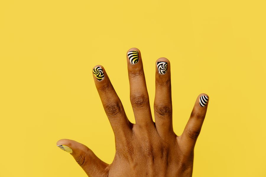
A skittle manicure—assigning a different color to each of your five fingernails—is one of the most expressive ways to wear nail polish. However, choosing five separate bottles without an underlying system often leads to a set that feels accidental or chaotic rather than artfully curated.
The secret to a successful multi-shade set is not finding five colors that match, but ensuring they share at least one underlying visual property. When colors share a common level of saturation, a deliberate lightness progression, or an identical surface finish, the human eye interprets the hand as a single unified composition rather than five competing statements.
Planning your palette before heading into the salon allows you to experiment with color relationships on paper, verify bottle opacity, and build an intentional visual brief for your nail technician.
Defining the Skittle Manicure: Boundaries and Intent
Before picking shades, it helps to distinguish a skittle manicure from adjacent nail-art concepts:
- Skittle Manicure: A one-color-per-nail arrangement where each nail features a single main color of a distinct hue or shade. The visual variety happens across the hand, not within individual nails.
- Mismatched Motif Art: A style where each nail showcases a different illustration, pattern, sticker, or decorative theme (such as checkerboard on one finger, cherries on another, and French tips on a third).
- Ombré / Gradient Nails: A technique where two or more colors blend seamlessly into one another on a single nail plate (horizontal, vertical, or baby boomer gradients).
- Gradient Skittle (Tonal Skittle): A specific subtype of the skittle manicure where all five shades belong to the same hue family (for instance, five shades of pink or neutral beige) arranged from lightest to darkest.
A multi-hue version embraces distinct color families—such as pairing an olive green, a dusty mustard, and a slate blue—while relying on color theory to keep the palette grounded.
The Four Pillars of Color Harmony Across Five Fingers
To make five different shades feel related, try one of the following four organizing ideas; these are design options, not rules:
1. Saturation (Chroma)
Saturation describes the purity or intensity of a color—how vivid or muted it appears.
- One approach: Keep all five shades within the same saturation band.
- Why it Works: If you choose four soft, dusty pastels (a muted sage, a dusty rose, a butter yellow, and a pale lavender) and introduce one vivid neon electric blue, that blue will create a stronger accent. If your palette is earthy and desaturated, compare similarly muted shades as a starting point. If you choose rich, vibrant jewel tones, ensure all five possess comparable depth and brilliance.
2. Value (Lightness and Darkness)
Value refers to how light or dark a shade is on a grayscale spectrum.
- One approach: Distribute visual weight evenly or follow an intentional progression.
- Why it Works: When one nail is near-black (very low value) and the other four are pale creams (very high value), the dark nail creates a heavy visual "black hole" that pulls focus away from the rest of the hand. You can either keep all five shades within a similar mid-tone value range, or deliberately arrange them in a smooth step-down gradient from thumb to pinky.
3. Undertone and Temperature
Color temperature separates shades into warm (reds, oranges, warm yellows, yellow-greens) and cool (blues, blue-greens, purples, cool grays).
- One approach: Establish a dominant temperature or create an intentional bridge.
- Why it Works: A set composed of four warm autumnal shades (terracotta, mustard, burnt sienna, olive) feels instantly cohesive. If you introduce a cool shade like slate or periwinkle, use it deliberately as a central accent or balance it with a neutral bridge shade (such as oatmeal or warm cream) so it does not look like a salon mistake.
4. Shared Texture and Finish
Finish refers to the reflective quality of the cured lacquer or gel: creme, jelly, metallic, shimmer, magnetic, or matte.
- One approach: Maintain an identical surface finish across all five nails.
- Why it Works: A shared finish can help unify a palette. Five completely disparate colors may feel more related if they all share the exact same opaque creme finish, the same translucent squishy jelly texture, or the same velvety matte topcoat. Conversely, mixing one high-sparkle glitter nail into four sheer jelly nails creates an additional contrast you may or may not want.
Anchoring with Technique: Structural Uniformity
Color is not the only way to establish harmony across five fingers. You can also introduce a consistent geometric treatment that frames each color identically.
For example, OPI's multicolored skittle French-tip tutorial illustrates how a shared structural element can unite contrasting shades: each nail features a different vibrant hue, but because every color is confined to an identical French tip over a matching sheer neutral base, the set feels balanced and deliberate.
Using a shared structural anchor—such as identical tip geometry, a uniform negative-space half-moon, or a consistent micro-border—creates an architectural baseline that allows you to be much bolder with your hue choices.
Finger Sequencing: How to Order Five Shades Across the Hand
Once you have selected your five shades, deciding which color sits on which finger dictates the rhythm of the finished manicure. Here are three reliable sequencing strategies:
Sequencing Strategy Comparison (Left Hand Example):

1. Value Slope (Lightest to Darkest):
   [Thumb: Off-White] -> [Index: Soft Sage] -> [Middle: Dusty Ochre] -> [Ring: Warm Clay] -> [Pinky: Deep Forest]

2. Grounded Bookends (Anchored Thumbs & Pinkies):
   [Thumb: Deep Navy] -> [Index: Cornflower] -> [Middle: Pale Cream] -> [Ring: Dusty Blue] -> [Pinky: Deep Plum]

3. Central Accent (Focal Ring Finger):
   [Thumb: Taupe] -> [Index: Warm Gray] -> [Middle: Greige] -> [Ring: Terracotta Accent] -> [Pinky: Muted Clay]
The Value Slope
Arrange the shades in order of lightness, starting with the lightest tone on the thumb and moving progressively darker toward the pinky (or vice versa). This creates a visible progression even when the hues themselves belong to completely different color families.
Grounded Bookends
Place your two deepest or most grounding shades on the thumb and pinky. Because the outer fingers frame the hand, giving them similar visual weight can frame the lighter middle shades when your hand is resting naturally.
The Central Accent Finger
If one color in your five-shade lineup is significantly brighter or more saturated than the others, place it on the ring finger or middle finger. Flank it with your softer, more neutral shades to let it act as an intentional focal point.
Hand-to-Hand Symmetry
Consider how both hands interact. You can choose:
- True Reflection: The same colors occupy the matching fingers on both hands (e.g., both thumbs are terracotta, both index fingers are sage).
- Continuous Flow: The palette reverses on the opposite hand (e.g., left hand goes light-to-dark from thumb to pinky; right hand goes light-to-dark from pinky to thumb).
- Shuffled Pairings: The same five bottles are used on both hands, but assigned to different fingers to create a playful, asymmetrical rhythm that still shares a closed color palette.
Skittle Manicure Cohesion Matrix
| Strategy | Primary Mechanism | Visual Effect | Best Scenario | Common Pitfall |
|---|---|---|---|---|
| Shared Saturation | All shades share identical muted, pastel, or jewel-toned intensity | Harmonious, soft, and balanced | Multi-hue palettes (e.g., pastel rainbow, muted garden) | Introducing a single neon or pure primary shade |
| Tonal Value Scale | Single hue or close analogous family arranged by lightness | Sophisticated, elongating gradient | Neutral sets, monochrome greens, brown/terracotta scales | Picking two shades that are too close in value to distinguish |
| Neutral Bridge | Three or four colors tied together by one grounding neutral (taupe, cream) | Grounded, easy to wear across work environments | Complementary pairings (e.g., olive + terracotta + oat) | Letting the neutral look washed out next to rich tones |
| Uniform Finish | Identical surface texture (creme, sheer jelly, or matte topcoat) | Polished, cohesive designer aesthetic | Contrasting or eclectic color choices | Mixing opaque cremes with textured glitters without a bridge |
The Salon Planning Swatch Worksheet
Use this planning structure to organize your thoughts and test your shade combinations before your appointment:
SKITTLE MANICURE PALETTE WORKSHEET
---------------------------------------------------------------------------------
Palette Theme / Mood: ___________________________________________________________
Target Finish:        [ ] Opaque Creme   [ ] Translucent Jelly   [ ] Velvet Matte
Dominant Saturation:  [ ] Dusty / Muted  [ ] Soft Pastel         [ ] Rich / Deep
---------------------------------------------------------------------------------

FINGER       PLANNED SHADE / HUE        VALUE (1-5)    ROLE IN PALETTE
Thumb:       ________________________   [Light/Dark]   [Grounding / Focal / Neutral]
Index:       ________________________   [Light/Dark]   [Transition / Main Hue]
Middle:      ________________________   [Light/Dark]   [Center Anchor / Neutral]
Ring:        ________________________   [Light/Dark]   [Accent / Contrast]
Pinky:       ________________________   [Light/Dark]   [Grounding / Bookend]

Cohesion Check:
[ ] Do all five shades share the same surface finish?
[ ] Is there any shade whose brightness or darkness completely overpowers the others?
[ ] When resting the fingers together, does the color sequence feel rhythmic?
---------------------------------------------------------------------------------
Hypothetical Worked Example: The Muted Botanical Palette
To see these principles in practice, consider this hypothetical five-shade design created for a salon client seeking a fresh, earthy look:
- Thumb: Warm Terracotta Clay (Warm, medium-deep value, opaque creme)
- Index: Pale Sage Green (Cool, light value, opaque creme)
- Middle: Soft Oat Sand (Neutral, light-medium value, opaque creme)
- Ring: Dusty Mustard Ochre (Warm, medium value, opaque creme)
- Pinky: Slate Blue-Gray (Cool, medium-deep value, opaque creme)
Palette Rhythm Diagram:

[Terracotta] ---> [Pale Sage] ---> [Soft Oat] ---> [Mustard Ochre] ---> [Slate Blue]
  (Warm Base)      (Cool Tone)     (Neutral Bridge)   (Warm Tone)        (Cool Base)
Why This Combination Works
- Identical Saturation Band: None of these colors are neon or primary. Each shade has a touch of gray or warmth that keeps it in the "muted botanical" family.
- Bookended Weight: The Terracotta (thumb) and Slate Blue (pinky) are intended as the darker bookends; compare real swatches to judge their relative depth, framing the hand securely.
- The Neutral Bridge: The Soft Oat shade on the middle finger acts as a visual palette cleanser between the cooler green and warmer mustard, preventing color competition.
- Unified Creme Finish: All five lacquers are high-gloss opaque cremes, giving the nail surfaces a shared finish.
Salon Realities, Formula Trade-Offs, and Limitations
While color planning on digital screens or paper swatches is straightforward, translating your vision into real-world salon products involves practical constraints:
- Formula Opacity Disparities: In a salon rack, one bottle may be fully opaque in one coat, while another requires three coats to build density. This difference in layer thickness can make one nail look noticeably heavier or cloudier than the others. Ask your technician whether all five chosen bottles have compatible pigment densities.
- The Brand Swatch Disconnect: Different nail polish brands calibrate their tones differently. A "sage green" from one manufacturer may have warm yellow undertones, while a companion brand's sage leans heavily into cool blue. Compare finished swatches; the same brand or line does not guarantee identical opacity or gloss.
- Service Duration and Pricing: Ask how the salon prices a five-shade set; the number of colors alone does not determine application steps or time. Review our nail art budget planning guide to understand how multi-color sets and custom swatch arrangements can affect appointment length and potential add-on fees.
- Subjective Aesthetics vs. Universal Rules: Personal taste and daily lifestyle matter far more than rigid color wheels. While color theory helps avoid unintentional clashes, there is no universally "flattering" palette for every skin tone. Wear colors that align with your wardrobe, your mood, and your daily aesthetic.
Next Step: Preparing Your Salon Visual Brief
Do not rely on verbal color descriptions like "soft green" or "dusty terracotta" at the salon counter—these terms mean different things to different technicians.
Instead, build a simple visual reference:
- Lay your reference images or swatches side by side in the exact finger sequence you prefer.
- Review our nail design consultation guide for tips on communicating finish preferences and curing expectations clearly.
- When you sit down with your nail technician, present your visual brief, check the physical swatch sticks together under salon lighting, and confirm that the formulas deliver the cohesive, unified set you planned.