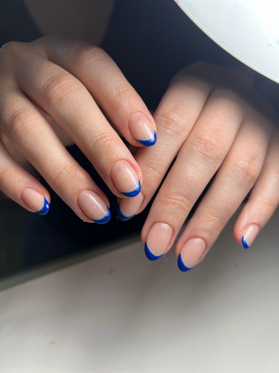
The main difference between stiletto and almond nails is the tip: stiletto finishes in a more pronounced point, while almond has a softer, rounded taper. Choose stiletto when the pointed outline is central to the look you want; choose almond when you prefer a tapered shape with a less dramatic endpoint. Compare them at similar lengths before deciding.
The right choice also depends on your routine, current nails, and the service a professional recommends. A photo can help you choose an appearance, but it cannot establish durability, physical fit, or whether you need extensions.
Look at the tip rather than the label alone
Inspiration photos do not always use shape names consistently. One person's sharply tapered almond reference may look close to another person's softer stiletto example.
Describe the visible feature you want: a distinct point, a gently rounded tip, a narrower taper, or a less dramatic outline. Bring a reference and identify the tip directly instead of relying on the name alone.
Separate length from sharpness. A long almond set can look more dramatic than a shorter pointed reference. If you compare those images without noticing the length difference, you may attribute the effect to the wrong feature.
Also inspect the camera angle. A finger pointed toward the camera can make the tip look shorter or broader than a straight-on view. Use clear views when comparing outlines.
Compare the design trade-offs
| Feature | Almond direction | Stiletto direction |
|---|---|---|
| Tip | Rounded endpoint within a taper | More pronounced point |
| Visual emphasis | Softer continuation of the outline | Tip becomes a stronger focal feature |
| Simple color | Lets the curved silhouette lead | Makes the pointed geometry prominent |
| Art placement | Curves and motifs can follow the softer outline | Lines and tip details can emphasize the point |
| Consultation focus | Desired taper and roundedness | Desired point, length, and practical service options |
Neither shape guarantees a specific level of comfort or wear. Construction, length, materials, application, and how you use your hands all belong in the salon discussion.
Use the table to describe preferences, not to decide that one shape is universally suitable for a certain finger or hand type.
Choose the length before adding complicated art
Identify the length you would realistically like to wear. If you currently keep your nails short, a very long reference represents a larger change than the shape label alone suggests.
Think about ordinary tasks: typing, using your phone, handling small objects, playing an instrument, or any activity where you have a strong preference for how your fingertips work. Explain those tasks to the professional.
Ask how the desired outline can be interpreted at that length. A dramatic point in a long reference may not translate into the same visual effect when shortened. Let the professional assess the real nail and service rather than attempting to reproduce the reference's proportions yourself.
If you are unsure, compare a preferred option with a less dramatic fallback. You might keep the tapered look while choosing a softer tip or a length closer to what you already know.
Match art to the outline you want to emphasize
Plain color for a fair shape comparison
Use the same simple color and finish on both shapes when deciding between them. This removes a major distraction and makes the outline easier to judge.
A pale glossy almond design and a dark chrome-like stiletto design may produce different reactions because of color and finish, not just tip shape. Compare complete looks only after you understand that distinction.
Tip-focused designs
A French-inspired tip or a contrasting edge can emphasize the difference between the outlines. Decide whether you want the art to make the point more obvious or to soften the overall impression.
Keep tip width and visual density similar in a comparison. If one image has a broad block of color and the other a fine line, the pattern itself changes the balance.
Abstract or accent art
Curves, sparse lines, and small motifs can work as design directions for either shape, but the placement may need adjustment. A motif crowded into the narrow tip may be less clear than one placed farther back on the nail.
Let the professional adapt the pattern instead of shrinking a reference unchanged. The minimalist nail-art guide offers ways to preserve a strong idea with fewer details.
Use a controlled virtual comparison
NailMoodLab provides prompt-based design generation, hand-photo nail-shape suggestions, and two-image virtual try-on. Generated designs can be regenerated, downloaded, shared, or copied by URL.
Begin with one clear hand photograph. Use consistent lighting and keep the nails visible. Compare references that differ mainly in the tip, with similar visual length, color, and finish.
A starting prompt could be:
Medium almond nail concept with a softly rounded taper, plain muted rose color, glossy finish, no art or raised decoration.
For the second direction, replace the shape description with a more pointed stiletto concept while keeping the other details stable. Inspect whether the output actually makes the requested distinction.
Use virtual try-on to explore the appearance on your photo, then compare the result with the original. If finger proportions or nail-bed boundaries change, do not treat that alteration as a flattering effect of the shape.
Review the whole hand, then the tips
Look at the previews at an ordinary display size first. Which overall impression do you prefer? Does the point draw more attention than you want, or is that exactly the feature you like?
Then inspect each nail more closely. Check whether the tips are consistent, whether the shape remains inside a coherent boundary, and whether the image has invented unusual angles or merged fingers.
If one preview is much more distorted, regenerate or find a clearer reference before comparing. A poor rendering of almond beside a polished rendering of stiletto is not a fair test of the shapes.
Save the preferred image and a short explanation: “I like the taper, but I want a softer tip,” or “The point is the main feature I want to keep.” That note is useful even if the final salon version differs.
Ask the salon about feasibility and upkeep
Show the references and describe your current length and routine. Ask what can be achieved with the service you are booking and whether the proposed look requires a different approach or additional time.
Do not assume extensions are necessary or unnecessary from the shape name alone. The professional should assess your real nails and explain the options for the intended result.
Ask about expected maintenance, appointment timing, and price for that specific service. Avoid accepting an image as evidence that one shape will always last longer or require less upkeep.
The salon reference-photo guide can help you separate essential preferences from flexible details. If practicality requires an adjustment, identify whether you would rather shorten the set, soften the point, or simplify the art.
Avoid these common comparison mistakes
Choosing from two completely different looks. Keep color, finish, and approximate length similar when evaluating the tip.
Treating “almond” as a precise specification. Show the degree of taper and roundedness you mean.
Assuming a preview predicts daily comfort. A rendered image shows appearance, not how the set will feel during your tasks.
Equating a sharp-looking image with a feasible service. Ask the professional to assess the actual nails and construction options.
Selecting art before deciding the outline. A complex pattern can hide which part of the shape you really prefer.
Final stiletto-versus-almond checklist
- The desired tip is described beyond its name.
- Length is considered separately from sharpness.
- Comparisons use similar color and finish.
- Daily tasks and comfort preferences are explained.
- Preview artifacts are checked against the source photo.
- Art placement can adapt to the chosen outline.
- Feasibility, upkeep, time, and price are confirmed with the salon.
Explore both directions with NailMoodLab virtual try-on, then take the preferred tip and length reference to a nail professional. If you plan looks regularly, review your current account allowance and available plan information. Consider a future purchase only when checkout becomes available and the offer fits your actual use.