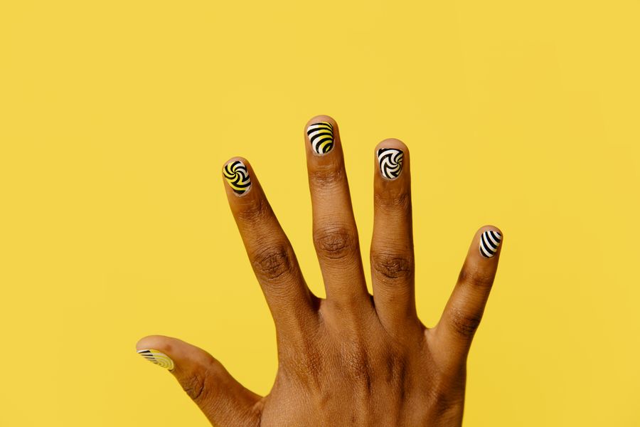
Fitting a full word across multiple fingernails creates an eye-catching visual statement, but shrinking typography down to miniature nail plates often leads to cramped, illegible results. To keep multi-nail lettering crisp and readable, you must treat your hand as a continuous canvas while respecting the unique width, curvature, and movement of each individual finger.
Legibility depends on four practical design choices: matching letter counts to natural finger groupings, keeping character strokes away from curved sidewalls, maximizing contrast against the base color, and deciding whether the text faces you or an outside viewer. Planning these visual elements in advance allows your nail technician to evaluate the design accurately during your appointment.
How Typographic Scale Works on Curved Nails
Typography on a flat surface behaves differently than typography on a human nail plate. Natural nails feature a transversal arch (the C-curve) that slopes downward on the lateral sides. When a character extends too close to the outer margins of the nail, the visual curvature compresses the letterforms, making wide letters like "M," "W," or "O" look distorted or cut off when viewed from above.
To maintain clarity, keep important strokes in a central area visible in your chosen hand pose; there is no universal percentage or named zone for every nail. Leaving generous negative space around each character ensures that the letter maintains its intended proportions in the pose used to review the design; no layout is equally readable from every angle.
OPI’s blog offers general nail-design inspiration. The specific layouts below are editorial planning suggestions, not verified salon outcomes.
4 Steps to Plan Your Multi-Nail Word Layout
Planning your typographic manicure systematically prevents spacing miscalculations and ensures each letter remains distinct.
1. Map Characters to Finger Real Estate
The four fingers on a single hand provide four distinct canvas widths:
- Index finger: Medium canvas width, high visibility.
- Middle finger: Check its actual width rather than assuming it is widest.
- Ring finger: Medium-narrow canvas width.
- Pinky finger: Smallest surface area; prone to crowding.
Four-letter words fit naturally across the index, middle, ring, and pinky fingers, leaving the thumb as a neutral accent or solid frame. If you want to spell a five-letter word on one hand, placing the first letter on the thumb requires someone to rotate their hand to read the full word sequentially. Alternatively, eight- to ten-letter words can be split across both hands, requiring you to bring your hands together to complete the phrase. Reviewing a nail length guide can also help you assess whether your current natural plate length provides enough vertical room for taller letter ascenders and descenders.
2. Choose Block or Monoline Typefaces
Elaborate scripts, Gothic calligraphy, and fine-serif typefaces contain delicate hairlines that easily bleed together on small scales. For multi-nail words, monoline sans-serif fonts (where every stroke possesses equal thickness) or simplified block capitals can be useful starting points for a legibility comparison. If you prefer a decorative style, opt for bold, high-contrast serif letters where the primary stems remain thick and distinct.
3. Establish High Tonal Contrast
Subtle tone-on-tone color palettes, such as pale pink lettering over cream, flatten letterforms and cause them to blur into the background. For maximum legibility:
- Light-on-dark: Crisp white, cream, or metallic lettering positioned over deep navy, forest green, or black.
- Dark-on-light: Deep espresso, charcoal, or jet-black lettering painted over sheer milky white, nude, or soft pastel bases.
The background finish also impacts readability. A solid cream or sheer jelly base keeps the background quiet, whereas busy glitter or marble textures compete visually with the outlines of the characters.
4. Decide on Reading Orientation
Before painting begins, establish which direction the letters should face:
- Outward-facing (viewer perspective): The bottoms of the letters sit near your cuticle and the tops face your free edge. Check this orientation in the exact hand pose you intend to photograph; the viewer’s direction changes with the pose.
- Inward-facing (wearer perspective): The tops of the letters face your cuticles, allowing you to read the word when looking down at your own hands.
Typography Layout Planning Matrix
Use this comparison table to choose the distribution method that matches your target word and hand anatomy:
| Layout Strategy | Letter Distribution | Ideal Word Length | Readability Trade-off |
|---|---|---|---|
| Four-Finger Spread | Index to Pinky (one hand) | 4 letters (e.g., "LOVE", "CALM") | Balanced; pinky character must be scaled down slightly to avoid edge clipping. |
| Five-Finger Sequence | Thumb to Pinky (one hand) | 5 letters (e.g., "MAGIC", "DREAM") | Full hand coverage; reading requires holding the thumb parallel to the fingers. |
| Two-Hand Continuity | Left Hand (1-4) + Right Hand (5-8) | 8 letters (e.g., "STAR" + "DUST") | High impact; requires bringing both hands together in a flat plane to read. |
| Accent Finger Motif | Full word stacked on thumb or middle | 3–5 letters stacked vertically | Keeps other nails minimal; requires adequate nail length for vertical stacking. |
Hypothetical Walkthrough: Mapping "GLOW" on One Hand
To see how these principles function in practice, consider a hypothetical layout for the four-letter word "GLOW" on a medium-length almond or oval manicure:
- Base and Polish Selection: A solid, opaque midnight-navy base paired with bright ivory lettering applied with a fine detail brush or stamping plate.
- Index Finger ("G"): The rounded outer curve of the "G" is centered on the nail plate, with the open aperture facing rightward toward the middle finger.
- Middle Finger ("L"): Because the middle finger offers the widest canvas, the simple vertical and horizontal strokes of the "L" leave generous negative space, preventing visual heaviness.
- Ring Finger ("O"): The oval geometry of the "O" mirrors the natural curve of the cuticle line, centered squarely on the flat apex.
- Pinky Finger ("W"): Because the pinky nail is narrower, the chosen "W" glyph can easily crowd the sidewalls. The letter is condensed slightly in width, with strokes kept strictly within the central surface area.
- Thumb: Finished in matching solid midnight navy with no lettering, serving as a clean anchor.
This layout is intended to help check whether when the four fingers rest side-by-side, the letters read seamlessly from left to right without crowding the cuticle or disappearing down the lateral curves.
Common Typographic Pitfalls
Even well-conceived ideas can run into visual roadblocks if practical limits are overlooked:
- Overcrowding the Pinky: Attempting to force identical font widths onto the pinky and the middle finger causes the pinky character to wrap around the nail edge.
- Ignoring the Natural Gap: Fingers do not sit completely flush without effort. Ensure letters remain identifiable as individual characters even when there is space between your knuckles.
- Excessive Embellishment: Placing rhinestones, glitter flecks, or secondary foil accents directly over lettering creates visual noise that breaks up letter strokes.
Note on Planning Boundaries: NailMoodLab provides visual design inspiration and layout preview planning. We do not test chemical formulations, polish longevity, or salon application durability. Consult your professional technician regarding the appropriate medium—such as hand painting, stamping, or pre-printed decals—for your specific nail type.
Preparing Your Visual Brief for the Salon
Bringing a clear visual plan to your appointment helps your technician determine the best execution technique for your nail shape and surface size.
Checklist for your appointment:
- Defined Word & Spelling: Confirm the exact letter assignment for each finger (thumb through pinky).
- Font Sample: Bring a reference image showing your preferred lettering thickness and style.
- Contrast Verification: Confirm your base color and letter shade have distinct light-to-dark contrast.
- Orientation Choice: Decide in advance whether the lettering will face inward toward you or outward toward others.
Before sitting down for your manicure, organize your visual references and use our guide on nail design consultation to present a clear, structured concept to your nail technician. Reviewing the layout together ensures your chosen typography translates cleanly to your real-world manicure.