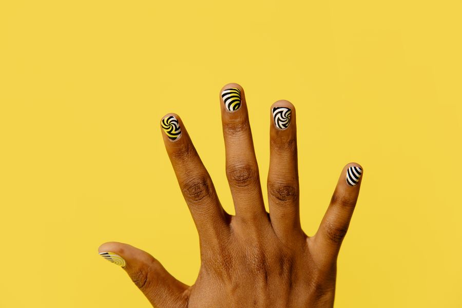
A watercolor nail design creates an ethereal, layered aesthetic by floating translucent washes of color over a pale or sheer base. Unlike opaque color blocking, watercolor manicures rely on soft, diffused perimeters and transparent overlaps that reveal subtle intermediate tones. However, because translucent colors interact visually where they meet, poor palette planning or hurried application can turn soft pastel washes into an unappealing, murky brown or muddy gray smear.
Achieving clean, luminous watercolor nail art in a salon comes down to three deliberate choices: selecting harmonious pigment undertones that blend cleanly, leaving negative space on the nail bed, and choosing the proper cosmetic layering technique. Planning these variables before your appointment helps your technician plan soft, intentional edges without unintended muddy mixing.
The Watercolor Mechanism: Translucency and Boundaries
To plan a watercolor set effectively, it helps to understand what sets this aesthetic apart from other popular blended manicure styles:
- Watercolor Nail Art: Characterized by irregular, organic patches of sheer pigment with feathered, fluid borders. Transparent patches overlap lightly, allowing the underlying base or secondary tints to filter through like diluted watercolor washes on textured paper.
- Marble Veining: Focuses on sharp, branching fractures and mineral fissures with high contrast between deep pigment veins and a solid background.
- Aura Nails: Centers on a single, symmetrical radial gradient that concentrates pigment intensely in the middle of the nail and fades uniformly outward in a soft sphere.
- Linear Ombre: Blends two or more solid colors along a straight directional axis—usually transitioning smoothly from cuticle to free edge or sidewall to sidewall.
+--------------------------------------------------------------------------+
| WATERCOLOR MANICURE: Sheer, floating patches with irregular soft edges   |
| [ Free Edge ]  (Translucent Wash A) --- (Overlap Zone) --- (Wash B)      |
| [ Nail Bed ]   === Translucent Milky Base / Bare Space Showing Through ==|
+--------------------------------------------------------------------------+
| AURA NAIL: Radial gradient fading symmetrically from a dense center      |
| [ Edge: Sheer ] ---> [ Mid-Band: Tint ] ---> [ Center: Concentrated Core]|
+--------------------------------------------------------------------------+
| MARBLE NAIL: High-contrast fine veining across a solid or opaque base    |
| [ Base Field ] ~~~ Sharp Fine Vein ~~~ Dynamic Branching Fractures ~~~   |
+--------------------------------------------------------------------------+
“Watercolor” Describes the Look
A watercolor reference does not identify the product used to create it. Ask the salon which nail-art system can produce the effect and whether its base, color, finishing products, and lamp are compatible. Do not substitute craft paints or household solvents, or dilute a gel unless its manufacturer specifically permits that procedure.
Palette Spacing: Preventing the "Muddy" Mix
Color mud occurs when opposing pigments mix together in equal measure, neutralizing each other into a flat, desaturated tone. On a tiny canvas like a nail plate, wet pigments bleed rapidly into one another if they are not separated physically or balanced harmonically.
1. Work with Analogous Harmonizers
A simple visual starting point is choosing neighboring shades on the color wheel:
- Warm Sunset: Sheer peach, rose pink, and apricot gold. When peach and rose overlap, the result may lean toward coral, depending on the actual products.
- Cool Coastal: Seafoam green, sky blue, and soft lavender. When blue and lavender overlap, the overlap may appear periwinkle; compare a swatch.
- Berry Meadow: Soft lilac, magenta, and sheer blush.
If you introduce contrasting or complementary colors—such as soft violet and warm ochre, or mint green and coral pink—consider separating them if the tested overlap is not the color you want. Keep them physically separated on different quadrants of the nail plate.
2. Preserve Base Canvas and Negative Space
Visible base color can help distinguish separate washes. All-over watercolor designs are also possible; judge the actual layering rather than applying a fixed coverage rule.
- Request a sheer milky-white or translucent soft nude base. A milky foundation acts as reflective backing, bouncing light through the sheer layers and keeping delicate washes vibrant.
- Try leaving a visible corridor of base color between selected patches. This negative space frames each soft edge and allows the eye to distinguish individual color washes.
Compare Methods Through a Finished Sample
Cirque Colors’ jelly-polish demonstration is an example of building color with sheer lacquer. A sponge gradient is not identical to an irregular watercolor patch; use the demonstration to discuss translucency rather than copying its process to a different product system.
Ask the technician to show the intended effect on a practice tip: how transparent the colors remain, whether the boundaries are soft, and what happens where two shades overlap. Blooming-gel, sheer-lacquer, and nail-ink methods have different instructions. This visual brief does not prescribe layer counts, mixing ratios, or lamp timings.
Comparing Soft-Blend Manicure Styles
Use this comparison table to decide whether a watercolor design or an alternative blending technique matches your style preference:
| Design Style | Dominant Visual Profile | Edge Definition | Blending / Layering Mechanism | Best Color Pairing Strategy |
|---|---|---|---|---|
| Watercolor | Translucent, floating, asymmetrical color washes | Soft, feathered, fluid perimeters | Overlapping sheer jelly layers, blooming gel, or cosmetic nail inks | 2–3 analogous shades over a milky translucent base |
| Marble Vein | Organic stone striations with high mineral contrast | Sharp, fractured, branching lines | Fine detail brushwork over a dispersing clear coat or wet base | High-contrast pairs (e.g., white base with gold, black, or deep jade) |
| Aura Glow | Concentric radial glow radiating outward from center | Soft, seamless circular fade | Airbrush, dry pigment powder, or sponge blending from a central core | High-contrast core to edge (e.g., hot pink core fading into baby pink) |
| Linear Ombre | Uniform horizontal or vertical gradient across plate | Seamless continuous transition | Dense sponge tapping or specialized dual-bristle ombre brush | 2 shades within similar temperature families |
Hypothetical Worked Example: Three-Color Floating Petal Placement
To visualize how palette spacing and negative space prevent muddy overlaps, consider this original three-color placement plan designed for an almond or squoval nail plate:
- Base: Two thin coats of semi-sheer milky white base.
- Color 1 (Sheer Lavender): Placed in the upper-left proximal zone, curving along the cuticle line and extending downward along the lateral sidewall for a portion of the nail length chosen on the sample.
- Color 2 (Sheer Peach): Anchored along the right lateral mid-wall, sweeping slightly toward the center. Its top edge overlaps the lower perimeter of the Lavender wash by a small amount tested on the sample, with the actual overlap color checked before approval.
- Color 3 (Sheer Sage Mint): Positioned at the lower-left free edge. Crucially, the Sage Mint wash is separated from the Peach wash by a clear corridor of the milky base canvas, preventing red-green complementary mud. It lightly kisses the lower boundary of the Lavender wash, with its resulting color checked on the sample.
- Open Corridor: An uninterrupted diagonal channel of the milky white base extends from the right cuticle corner through the nail center to the left tip, maintaining negative space.
+-------------------------------------------------------------+
| THREE-COLOR WATERCOLOR PLACEMENT MAP (ALMOND / SQUOVAL)     |
|                                                             |
|                 [ Proximal Cuticle Fold ]                   |
|   +-----------------------------------------------------+   |
|   | ( COLOR 1: Sheer Lavender )                         |   |
|   |  \                                                  |   |
|   |   \  [ Overlap Zone: Mauve ]                        |   |
|   |    \      ( COLOR 2: Sheer Peach )                  |   |
|   |     \      \                                        |   |
|   | [ Open Milky Base Channel / Negative Space Corridor]|   |
|   |       \      \                                      |   |
|   |  ( COLOR 3: Sheer Sage Mint )                       |   |
|   +-----------------------------------------------------+   |
|                     [ Free Edge Tip ]                       |
+-------------------------------------------------------------+
Sample Review Sequence
- Compare the base alone with one translucent patch.
- Add a second color on the practice sample using the chosen system’s instructions.
- Decide whether the overlap is desirable or needs a wider gap.
- Check the sealed finish, then record the approved layout and products.
Any intermediate setting step must follow the product instructions and cannot replace the required full cure. The client’s brief should describe the look, not invent a lamp exposure time.
Common Mistakes and How to Avoid Them
When planning watercolor nail designs, watch out for these frequent aesthetic and technical missteps:
- Expecting opaque coverage to look transparent: Compare a real swatch before choosing the colors. Ask for the desired translucency, without prescribing pigment chemistry or improvised dilution.
- Over-Manipulating Wet Pigment: Brushing back and forth repeatedly over wet blooming gel or fresh ink lifts the base layer and mixes all pigments together, resulting in a flat brown sludge. The fluid medium must be allowed to disperse naturally.
- Crowding the Free Edge on Short Nails: On short active-length nails, applying three large color patches can overwhelm the nail bed. Scale down your brief to two harmonious colors or place the art on just one or two accent fingers, keeping the remaining nails in a complementary sheer solid.
- Expecting Exact Clones of Digital Renders: Many viral social media images feature digitally manipulated filters with exaggerated dynamic range or saturation. Hand-painted cosmetic pigments behave according to fluid dynamics and surface tension. Accept subtle organic variation across each individual nail.
Next Steps: Preparing Your Salon Visual Brief
Before visiting your salon, outline your design specifications so your nail technician can prepare the necessary detail brushes and allocate enough time:
- Save Two Targeted Reference Images: Select photos specifically demonstrating sheer watercolor washes or blooming gel effects rather than airbrushed aura nails or marble linework.
- Select Your Color Pairings: Pick two or three harmonious, analogous shades. Explicitly note that you prefer translucent "jelly" opacity rather than solid creme coverage.
- Specify Your Base Tone: Choose whether you want a soft milky white, a sheer pink-tinted nude, or a crystal-clear negative-space foundation.
- Consult on Technique and Timing: Intricate multi-color layering and sample review may take longer than a standard gel polish change. Review our guide to preparing a nail design consultation to communicate placement goals and check your salon's available product lines.
- Plan for Service Add-On Costs: Custom hand-painted nail art and multi-step blooming gel applications typically fall into specialty salon pricing tiers. Consult our nail art budget planning guide to review standard art pricing structures and factor design time into your total appointment cost.
Write a clear visual brief and discuss the actual products and method with the nail technician before the service begins to ensure your finished manicure achieves clean, luminous watercolor softness.