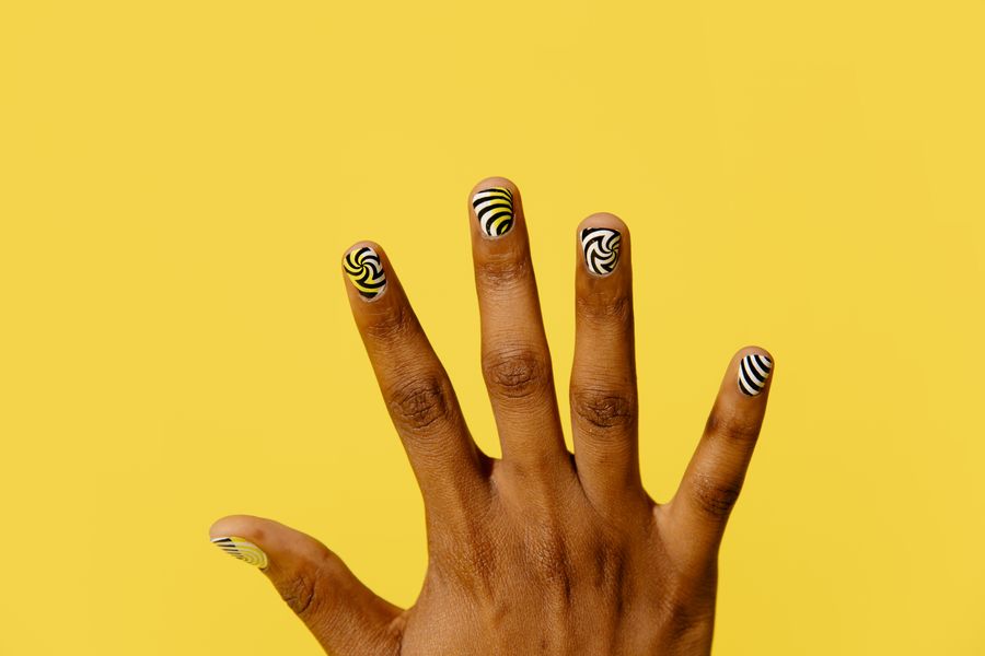
Comic nail art—often referred to as pop-art or cartoon nails—transforms a three-dimensional nail plate into what looks like a flat, cel-shaded animation graphic. This optical effect relies on three core design components: a saturated base color, a dark perimeter outline that mimics ink linework, and an off-center white highlight that imitates reflected light in classic comic panels. Optional graphic elements, such as miniature speech bubbles or action lettering, can serve as bold accent points.
Executing this look successfully requires deliberate planning before you visit a salon. Because hand-drawn outlines and geometric highlights alter the visual proportion of your nails, planning line thickness, reflection angles, and motif density in advance ensures your nail technician can assess the layout and apply it neatly to your natural nail shape.
The Visual Mechanics of Cel-Shaded Nail Art
The illusion of a two-dimensional cartoon on a curved surface depends on precise graphic conventions. Understanding how each component functions allows you to build a balanced set:
- Perimeter Ink Borders: A thin or medium dark border traced along the outer edge of the nail creates the graphic cartoon contour. On longer enhancements, a broader outline establishes visual weight, while shorter natural nails require a micro-fine stroke to prevent the border from crowding the base color.
- Directional Highlights: A curved white streak—sometimes accompanied by a detached dot or exclamation mark—simulates a harsh studio light source. For the illusion to read cohesively across the hand, the reflection must appear on the same relative side of every nail.
- Inner Shadow Creases: Some pop-art styles incorporate a crescent of deeper pigment along the inner perimeter opposite the highlight. This secondary shadow exaggerates the cell-shaded depth without requiring complex gradient blending. OPI’s blog offers general nail-design inspiration. The specific layouts below are editorial planning suggestions, not verified salon outcomes.
Step-by-Step Guide to Planning Your Design
Before booking a service, organize your design specifications so your technician can evaluate line weight and surface area feasibility.
Step 1: Calibrate Scale to Your Nail Length
Line work occupies physical space on the nail bed. Review a nail length guide to gauge how much usable canvas your preferred shape provides. A heavy black border on an active-length round nail can visually reduce the nail plate, whereas medium almond or long coffin shapes accommodate defined borders and text motifs comfortably.
Step 2: Establish Tonal Contrast
Comic art requires immediate legibility. Select an opaque, high-saturation base shade—such as cherry red, cobalt blue, bubblegum pink, or bright mustard—that provides high contrast against black ink outlines and stark white highlights. Soft pastels can also work, provided the base pigment remains solid and streak-free.
Step 3: Standardize the Light Source Angle
Decide where your imaginary light source originates before applying highlights. A common approach places the curved white streak along the upper-left lateral curve of each nail. If highlights drift inconsistently between left and right edges on neighboring fingers, the cohesive 2D cartoon illusion breaks.
Step 4: Map Speech Bubbles and Accent Nails
If your concept includes speech bubbles or action words (such as "POW" or "BAM"), designate specific fingers as focal points. In a mismatched nails layout, placing text or sound-effect bubbles on the thumbs or ring fingers keeps the set balanced while leaving the remaining nails framed with clean cel-shaded outlines.
Comic Nail Design Planning Matrix
Use this matrix to match your preferred nail canvas with proportionate comic elements:
| Nail Canvas | Recommended Border Weight | Highlight Placement | Graphic Accent Recommendation |
|---|---|---|---|
| Short Oval / Round | Hairline to micro-fine (compare at the actual nail size) | Single slender stroke along one lateral edge | Punctuation marks (exclamation or question mark) on ring finger |
| Medium Almond / Square | Medium outline (compare at the actual nail size) | Curved streak with a separate lower accent dot | Compact speech bubble or single short word on an accent nail |
| Long Coffin / Stiletto | Pronounced graphic outline (compare at the actual nail size) | Dual-tier highlights with subtle opposing drop shadows | Multi-panel motifs, burst lines, or layered lettering |
Pre-Appointment Design Checklist
- [ ] Base color chosen with sufficient contrast against pure black and pure white.
- [ ] Uniform highlight side selected across all ten fingers (e.g., upper left curve).
- [ ] Outline thickness scaled to preserve the central color field.
- [ ] Accent fingers mapped to avoid placing detailed text on smaller nail beds.
- [ ] Reference notes saved to show the technician your desired motif sizing.
Hypothetical Planning Scenario: Medium Almond Pop-Art Set
Consider a client planning a five-finger pop-art concept on medium almond extensions using a vivid coral base:
- Thumb: Coral base, medium black perimeter frame, white highlight streak on the left sidewall, small comic burst star in black and white.
- Index: Solid coral base, black perimeter frame, left-side white highlight streak.
- Middle: Solid coral base, black perimeter frame, left-side white highlight streak.
- Ring (Focal Accent): Solid coral base, black perimeter frame, centered white oval speech bubble outlined in black with a hand-lettered comic question mark ("?").
- Pinky: Solid coral base, delicate black perimeter frame, single slender left-side highlight.
Note: This layout represents a hypothetical design planning exercise. It organizes visual proportions and element distribution; it does not predict salon application times or guarantee wear performance on natural nails.
Common Planning Mistakes and Visual Trade-Offs
- Crowding the Perimeter: A heavy drawn border can leave too little base visible. Show the intended margin in your sketch and let the technician decide the application method.
- Inconsistent Highlight Direction: Alternating highlights between the left and right borders disrupts the optical trick. Keep light reflections uniform across the entire set.
- Overcrowding Small Nails: Attempting multi-letter words inside speech bubbles on small nail beds often results in illegible shapes. Restrict complex lettering to larger nails, such as thumbs.
- Underestimating C-Curve Distortion: A design element positioned too close to the lateral side curve may appear warped when viewed straight on. Center key words or symbols on the apex area of the nail.
Preparing Your Salon Consultation
Once you have established your visual layout, take these steps to review the concept with your technician:
- Check Proportions on Your Hand: You can compare nail designs on hand to evaluate how border weight and highlight scale suit your natural finger length.
- Review Technical Feasibility: Share your element placement and line-weight goals during your nail design consultation.
- Verify Compatibility with Your Technician: NailMoodLab provides visual design inspiration and preview planning; it does not evaluate chemical applications, manicure durability, or medical suitability. Review your planned design brief with your nail professional so they can recommend liner gels, detailing brushes, and finishing techniques compatible with your natural nail plate.