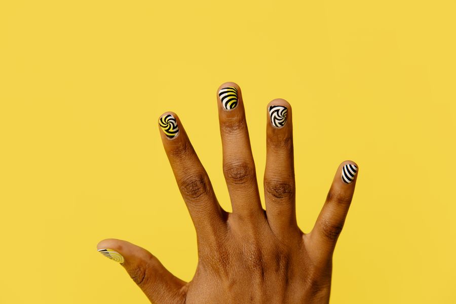
When you bring a photo reference to a manicure appointment, the lighting in that image determines how accurately your nail technician can interpret the design. A single photograph taken under an intense salon spotlight, a ring light, or a camera flash often obscures the true base color, overstates metallic shine, or creates glare that hides fine detail.
To give your technician a practical reference, use at least two images: one captured in even, diffused light to show the base color with fewer glare distractions, and a second photo taken under direct light to demonstrate surface finish, glitter depth, or chrome sheen. Separating base color from surface reflection gives your technician the visual clarity needed to assess design complexity, evaluate scale against your natural nail bed, and prepare appropriate salon materials.
How Different Light Sources Alter Color and Finish
Every light source has a specific color temperature and diffusion level that changes how polish pigments and specialty topcoats appear on camera:
- Indirect natural daylight: Light from an open window or light shade distributes evenly across the nail plate. It can be a useful reference, but daylight changes and camera white balance, exposure, editing and the viewing screen also affect color—helping you and your technician distinguish between cool berry and warm terracotta, or soft ivory and stark white.
- Direct sunlight or direct flash: Intense, directional beams cause specular reflection. While this helps reveal particle size in holographic glitters or the directional shift of magnetic cat-eye polishes, direct glare frequently washes out pale pastel bases and obliterates hand-painted line art.
- Warm interior lighting: Residential lamps and incandescent bulbs cast yellow and amber hues. This warmth makes cool neutral tones appear muddy and shifts sheer, milky bases toward yellow.
- Overhead fluorescent and ring lights: Cool-toned overhead lighting can flatten dimensions, while circular ring lights create bright, rounded reflection lines across the center of every nail. These artificial reflection bands often mask subtle ombre gradients or delicate border details.
OPI’s blog offers general nail-design inspiration. The specific layouts below are editorial planning suggestions, not verified salon outcomes.
Steps to Prepare Readable Nail Reference Photos
Following a structured approach when selecting or capturing reference images ensures your technician receives actionable visual information:
- Capture a base-color reference in even light: Take your primary reference photo outdoors in open shade or near a window with even light, avoiding a mix of differently colored light sources. Ensure your hand rests flat so light falls evenly across all five fingers without deep shadows.
- Photograph specialty finishes under angled direct light: If your desired look features chrome powder, magnetic velvet effects, or micro-shimmer, take a secondary photo under a direct desk lamp or sunlight. Tilt your fingers slightly so the camera captures the directional shimmer without bouncing harsh white glare directly back into the lens.
- Show scale relative to your entire hand: Macro close-up shots of an individual finger make tiny motifs look expansive. Include a wider shot showing your complete hand. Comparing design proportions against your natural nail bed helps your technician determine if an intricate pattern requires simplification to fit your nail shape. Pairing your references with a clear hand photo for nail try-on makes it easier to preview how the design scale translates to your own fingers.
- Clarify the design components in writing: Separate the elements in your reference into distinct notes. Note whether you want to replicate the base pigment, the glossy or matte topcoat, or specific decorative accents.
Reference Lighting Comparison
The table below outlines how common lighting environments behave and where each serves your design preparation:
| Lighting Environment | What It Can Help Show | Common Visual Distortions | Practical Use in a Design Brief |
|---|---|---|---|
| Indirect Daylight (Open shade, window light) | Base undertones, pigment opacity, fine-line motif placement | Mutes intense sparkle and deep metallic reflections | Primary reference: Use for color matching and overall layout |
| Direct Sunlight or Angled Flash | Chrome sheen, holographic particle dispersion, magnetic cat-eye lines | Washes out pale bases; causes whiteout glare spots | Secondary accent: Use to show particle size and reflective behavior |
| Warm Indoor Lighting (Lamps, restaurants) | General evening mood and low-light appearance | Imparts heavy yellow casts; distorts cool pinks and blues | Avoid for color matching: Misrepresents true base pigments |
| Studio Ring Light | Surface smoothness, cuticle line placement, apex curvature | Creates distracting halo reflections that hide surface nail art | Shape reference: Useful for checking nail silhouette, not surface art |
Hypothetical Planning Example: The Glazed Sage Manicure
Consider a hypothetical consultation scenario where a client wants a sheer glazed sage green manicure:
- Initial reference photo: The client brings a single screenshot taken under a beauty ring light. The ring light creates a blinding white glare line across each nail, washing out the base green and making it appear as an opaque pastel mint with a silver sheen.
- The consultation challenge: Looking at the initial image, the technician might pull an opaque light-green lacquer and a silver mirror chrome powder. However, the client actually envisioned a translucent jelly green with a soft golden pearl finish.
- The lighting correction: The client supplements the reference with a daylight swatch photo showing the sheer, tea-like transparency of the sage base, plus a video clip taken in angled natural light revealing subtle gold reflections.
- The outcome: In this revised nail design consultation, the technician has more information to discuss the intended transparency and warm reflection; the pictures do not determine a specific formula or guarantee the result.
Common Photo Mistakes and Visual Trade-Offs
- Relying on heavily filtered social media images: Many viral nail photos use smoothing filters that soften borders and saturate colors. If a photo shows skin with zero texture or glowing neon edges, the color values are likely digitally altered and cannot be matched precisely with physical gels or polishes.
- Confusing surface reflection with pigment density: A direct flash can make a sheer jelly polish look completely solid, or make dark magnetic particles look silvery. Check whether the color comes from the liquid base or from light bouncing off suspended mica.
- Ignoring the effect of skin contrast: Surrounding skin tone can change the perceived contrast of a polish; do not assume the same directional effect for every person and color. Look for reference photos featuring hands with a similar undertone to your own to judge contrast accurately.
- Separating visual inspiration from technical limits: A reference photograph demonstrates aesthetic layout; it does not dictate product compatibility, curing procedures, or durability on your specific nail type. Professional technicians choose systems based on natural nail structure and salon-grade formulas.
Checklist for Preparing Your Reference Photos
Before heading to your appointment, verify your visual references against this checklist:
- [ ] One daylight reference: Includes a balanced photo taken in indirect natural daylight showing the base shade with limited glare, while recognizing camera and screen color differences.
- [ ] One direct-light reference: Includes a photo showing shimmer, chrome reflection, or topcoat texture (if applicable).
- [ ] Full-hand perspective: Features a photo displaying all fingers together to confirm spacing and motif balance.
- [ ] Unfiltered clarity: Use the original if available and note whether editing is known; appearance alone cannot confirm an image is unfiltered.
- [ ] Design element breakdown: Identifies whether the priority is base shade, art placement, or surface finish.
Next Steps
To turn your reference photos into an actionable plan, organize your selected images and notes into a coherent visual summary. Digital planning resources like virtual nail try-on tools can help you test color contrasts and layout proportions against your available hand reference before your visit.
Present your visual brief to your nail professional at the start of your appointment. They can evaluate the design against their professional product inventory, verify structural compatibility with your natural nails, and adjust the motif scale to deliver a balanced result.
A photograph cannot guarantee an exact color match. Confirm the final shade with an actual product swatch under the salon lighting, and describe whether color, translucency or reflection is the priority.
Adobe’s white-balance guide explains how lighting can create a color cast and how camera or editing adjustments change its appearance. That is why an even-light photograph is a reference, rather than a guaranteed pigment match.